The 13 Best Restaurant Websites You Can Learn From
Find inspiration from these great restaurant websites and learn about key features that attract new customers, generate loyalty and increase profits.
- Branding and design help your restaurant stand out from the competition, boosting brand recognition and attracting new customers.
- The best restaurant websites are easy for customers to use and strategically formatted to rank well in Google search results.
- The most important design features prioritize functionality and user-friendliness, but they vary depending on your restaurant's goals—an online ordering widget increases direct sales, while seasonal CTAs promote sales of specific dishes.
- High-quality menu photos are essential, as 84% of U.S. restaurant guests look at them before ordering.
A beautiful restaurant website enhances the customer experience, but the functionality and user-friendliness are what really drive sales. With 52% of consumers saying food delivery and takeout are essential to their lifestyle, a poorly designed site leaves money on the table.
I’ve analyzed 13 of the best restaurant websites to show you exactly how top-tier brands use website design to drive growth. In this guide, we'll break down the specific, revenue-generating principles they’re using so you can easily implement them on your own site.
Before we dive in, here are a few key considerations for your restaurant website’s design:
- Simple, mobile-friendly design
- Beautiful, functional online menu
- Seamless checkout options
- A place to display customer reviews and ratings
- Mouthwatering food photography
1. Monster Vegan
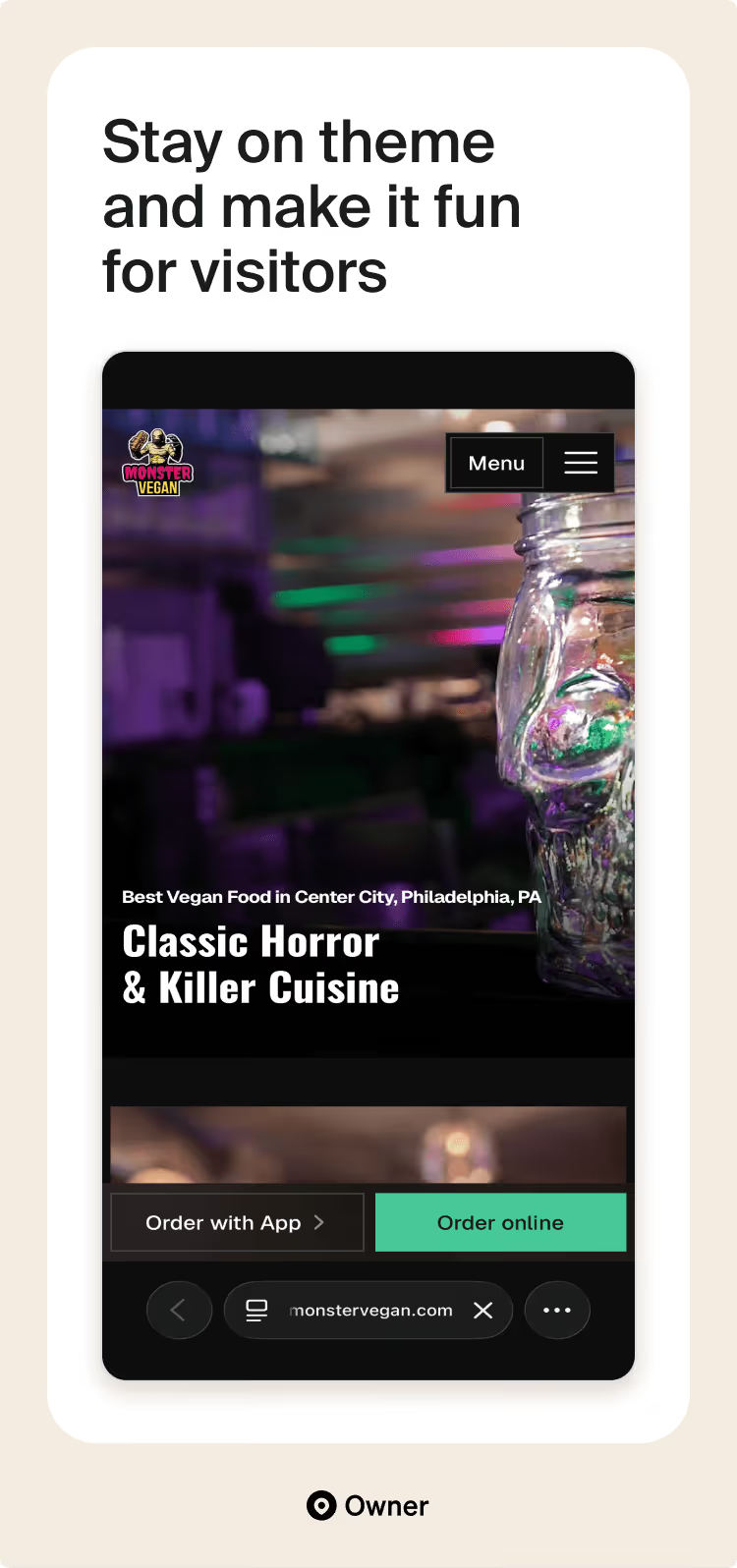
The Monster Vegan site is one of the best restaurant website designs I’ve seen. It’s a perfect example of how to make a restaurant feel like a real destination. Within a few seconds of landing on the page, you know exactly what kind of movies they’re playing, what the food looks like and exactly where to find them in Philly.
The best part is how easy it is to actually buy something. I love that they’re honest about their pricing, telling you straight up that it’s cheaper to order directly from them than through apps like DoorDash. It’s a small, human touch that makes you want to support them.
Whether you’re on your phone or a laptop, the "Order Now" buttons are always right there when you need them. It’s rare to find a site this much fun to look at while still so focused on making life easy for the customer.
Why we love it:
- Personality with purpose: The "horror" theme is everywhere, from the spooky copywriting to the dark color palette, but it never gets in the way of finding the "Order" or "Reservation" buttons.
- Direct & honest messaging: By telling customers it’s cheaper to order through the site than on third-party apps, they build instant trust while boosting their own profit margins.
- Mobile-first simplicity: The layout is built for people on the go. Large buttons, clear categories and a "sticky" navigation bar mean you can go from "hungry" to "ordered" in just a few taps.
2. Que Vida Tacos
There’s a specific feeling you get when you walk into a bright, modern taco shop with big windows and fresh salsa already on the table—and that’s exactly what the Que Vida Tacos site captures digitally.
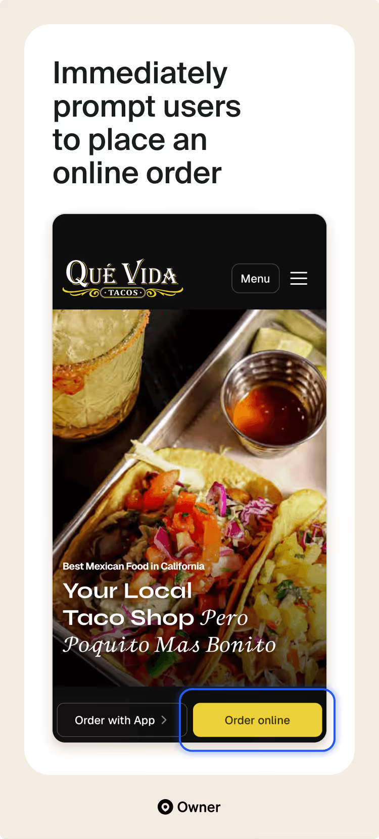
They lean heavily into their tagline, “Pero Poquito Mas Bonito” (a little bit prettier), and you can see it in every design choice. Instead of just a wall of text, they use beautiful photography and elegant fonts to show you that they aren’t your average "hole-in-the-wall" stand.
What really stands out from a practical side is how they’ve mastered the multi-location layout. Usually, when a restaurant has three different spots, the website becomes a cluttered mess of different addresses and hours, but here, it’s incredibly streamlined.
Why we love it:
- Elevated visuals: The high-end photography and "pretty" design elements live up to their brand promise of being a "little bit more beautiful" than the competition.
- Multi-location simplicity: They handle three different locations without cluttering the homepage, making it easy for users to find the correct hours and directions instantly.
The "support local" push: By clearly explaining that ordering directly saves the customer money and helps the business, they create a "win-win" feeling that encourages loyalty.
3. Forage
By highlighting its commitment to healthy, sustainable food and showcasing unique menu items, Forage attracts a health-conscious clientele. The website's clear focus on the restaurant's specialties and use of compelling visuals drive customer engagement and conversions.
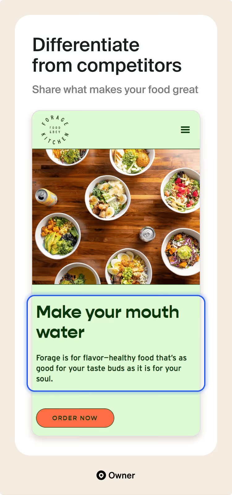
You don’t even have to scroll to learn that Forage makes healthy and delicious food, thanks to clear headings, CTAs and original photography showcasing specialty salads, grain bowls and original Forage Kombucha.
Why we love it:
- Vibrant, honest visuals: They use massive, high-definition photos of their bowls that showcase every seed, leaf and protein. It creates a "what you see is what you get" level of trust that is essential for health-conscious diners.
- The "Forage" lifestyle: Instead of just listing menu items, they promote their custom kombucha and local story, turning a simple meal into a brand experience you actually want to be a part of.
Zero-friction navigation: The site is stripped of any unnecessary fluff. The path from the homepage to the checkout screen is incredibly short, making it one of the most efficient "fast-casual" sites I’ve seen.
4. Ottavio's Italian Restaurant
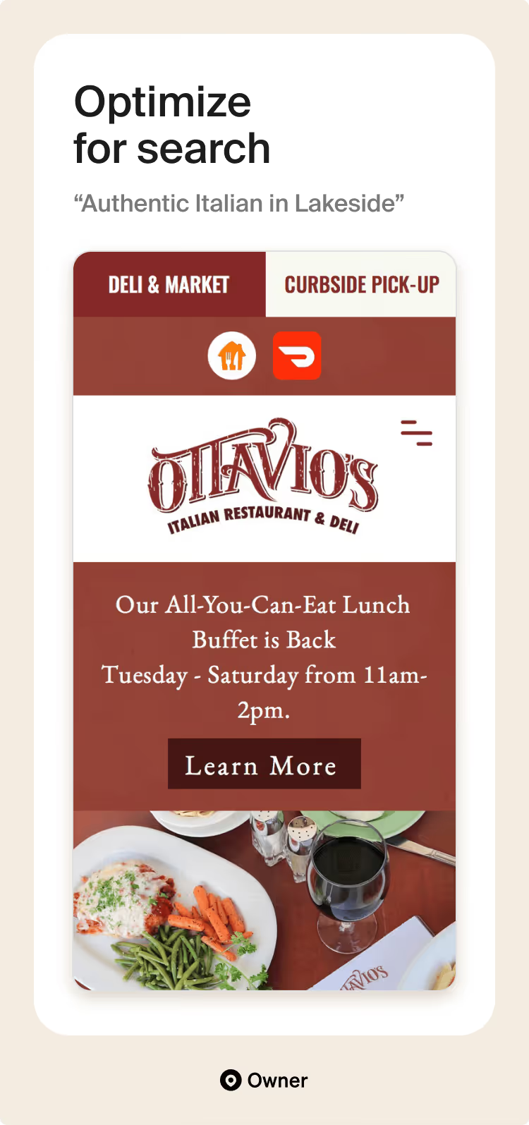
Ottavio’s website features a clean, elegant design with a strong focus on high-quality food photography that showcases their delicious Italian dishes. The user-friendly online ordering system and prominent customer reviews build trust and encourage online orders.
Their secret sauce for boosting sales? Creating dedicated pages for key menu items improves Ottavio's website's visibility on Google. This is crucial because the top search result typically receives ten times more clicks than a page ranking tenth. That higher visibility translates to a greater chance of attracting customers to their site.
Why we love it:
- Segmented user journey: Immediately offers three clear paths: Bakery, Deli or Café. It respects the user's time by letting them jump straight to the specific "shop" they’re looking for without having to dig through a generic menu.
- Elegant simplicity: The site uses a lot of white space and classic typography, which mirrors the experience of a clean, well-curated Italian boutique. It manages to feel sophisticated without being cold or intimidating.
5. Maciel's Plant Butcher Shop
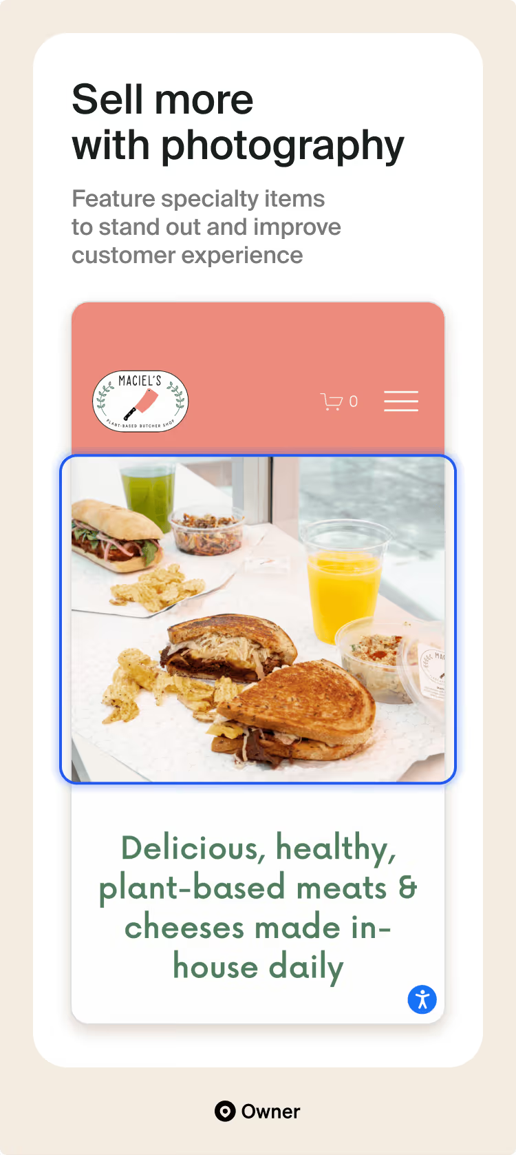
Maciel's uses high-quality food photography to entice customers and showcase their specialties. Their strategic placement of images throughout the website allows them to answer user questions and highlight seasonal offerings.
They even feature their Instagram feed at the bottom of the homepage to increase social media engagement. In addition to beautiful food photography, Maciel's shares news articles and personal stories to foster a sense of connection that goes beyond dining.
Why we love it:
- Intuitive menu layout: They break the menu down into clear, visual sections (like "Cold Sandwiches" and "Meats by the Ounce"), which makes it incredibly easy for first-time visitors to understand how a plant-based butcher actually works.
- Community integration: The live Instagram feed at the bottom keeps the site feeling current and connects the digital experience to the physical shop’s daily specials and local vibe.
6. Talkin' Tacos
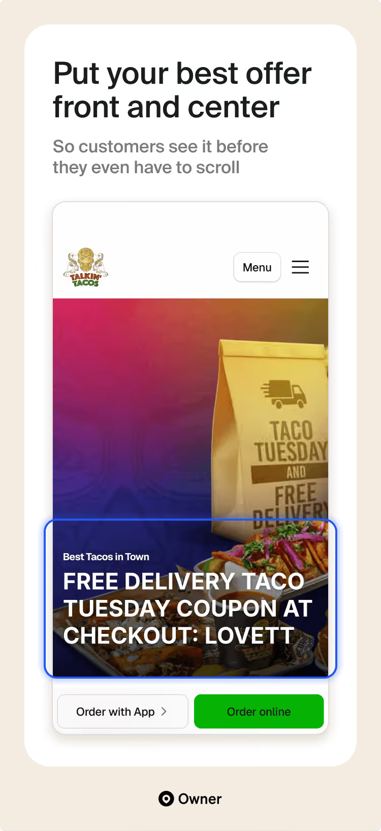
Talkin' Tacos highlights the power of a well-executed loyalty program. They use colorful, clear calls to action (CTAs) throughout the website to target conversion goals, like “Order Now” for online sales and “Join Rewards” to engage their repeat customers and collect valuable data. This focus on customer retention has significantly boosted direct online sales.
In fact, in a previous loyalty program campaign, their pop-up CTA helped Talkin’ Tacos gather over 40,000 customer contacts, driving repeat orders and growing direct online sales to $120,000 a month.
Why we love it:
- Late-night optimization: The clear display of extended operating hours (up to 5:00 AM) and direct "Order Now" links for dozens of locations makes it the ultimate resource for the late-night crowd.
- Zero-friction promotions: Placing active coupon codes (like "LOVETT" for Taco Tuesday) directly in the header is a brilliant move that rewards visitors immediately and drives higher conversion rates.
7. Kuma's Corner
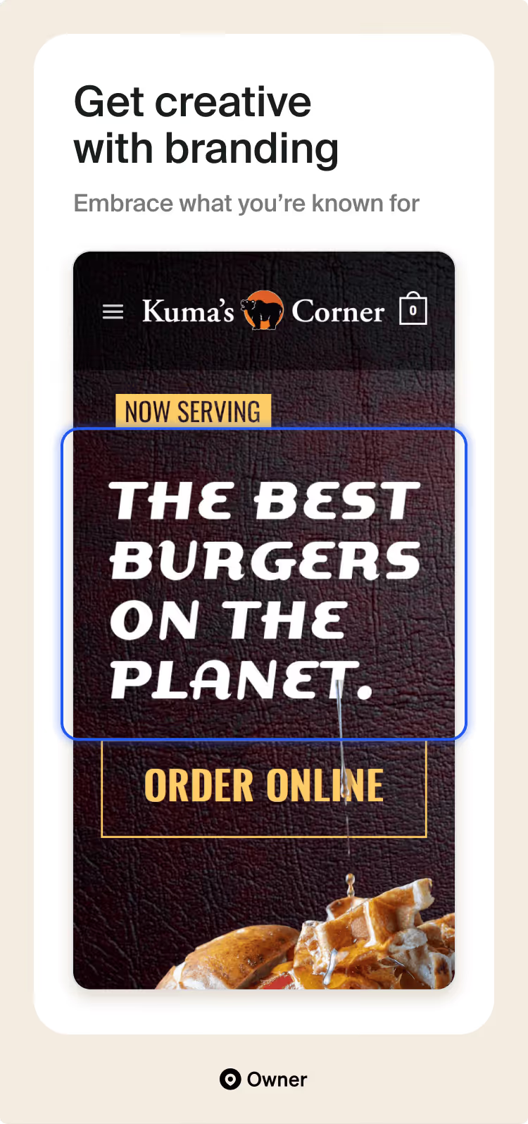
Kuma's Corner uses its unique brand identity to create a memorable online experience. Their website features bold imagery, captivating copy and a strong focus on the restaurant's signature burgers and beer.
Their menu is their strongest asset. Every burger is named after a heavy metal band (Black Sabbath, Iron Maiden, Mastodon), which turns a standard menu into a conversation piece. The descriptions are detailed, and they clearly highlight their unique "pretzel roll" standard, making the food feel as legendary as the bands.
Kuma’s Corner places bold claims like “Best Burgers On The Planet” next to original photography to show how good their burgers are. Plus, they back it up with high-profile reviews from Food Network and TIME.
Why we love it:
- Unapologetic branding: They lean fully into the "Metal Burger Mecca" persona. From the band-named burgers to the aggressive copy, the branding is consistent and unforgettable.
- The monthly hook: By featuring a "Burger of the Month" and "Burger of the Quarter," they give fans a reason to check the website (and the restaurant) regularly to see what's new.
- Community-driven design: The dedicated sections for community support and charity prove that they aren't just a restaurant; they’re a local institution with a heart.
8. Doo-Dah Diner
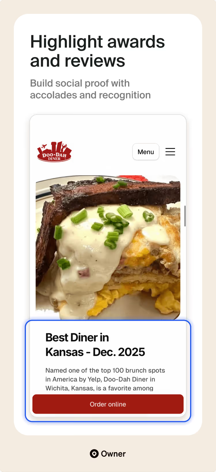
Doo-Dah Diner uses social proof to build trust and credibility by showcasing local awards, positive reviews and customer favorites on their homepage. This strategy effectively convinces diners to choose them over the competition, driving significant traffic and attracting new customers.
To further boost engagement, Doo-Dah Diner adds little hearts next to fan-favorite dishes on their menu, allowing customers to easily see popular items and vote for their own favorites.
Why we love it:
- Integrated waitlist logic: By putting a "Join Waitlist" button front and center, they solve the biggest pain point for popular diners (the long wait) before the customer even leaves their house.
- Trust-building transparency: They explicitly tell customers that ordering through the website is cheaper than third-party apps, which builds immediate trust and encourages direct support of the business.
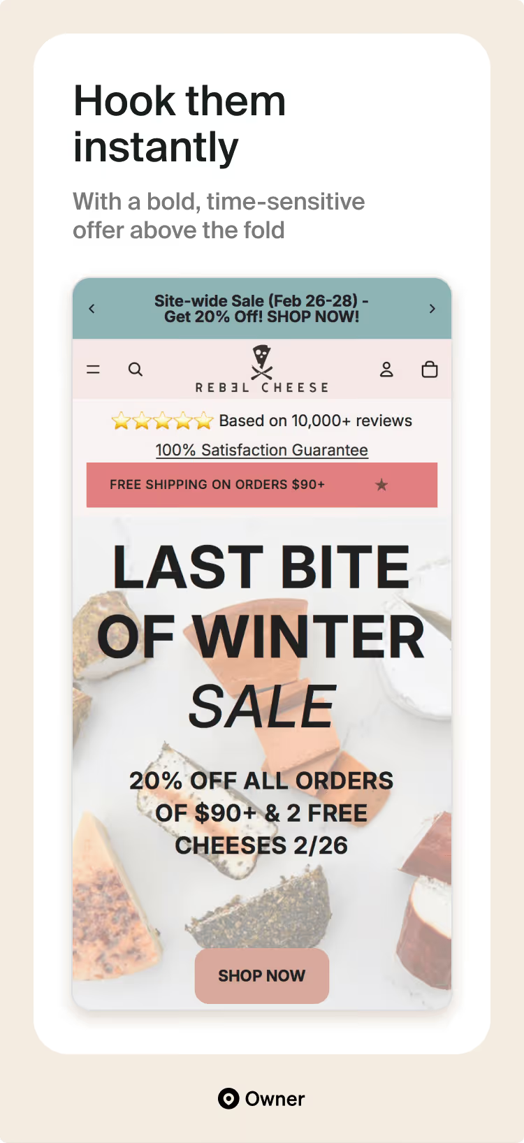
9. Rebel Cheese
Rebel Cheese demonstrates the power of effective restaurant marketing to drive website traffic and sales. Their informative blog posts, product pages and FAQs establish the brand as an authority in the vegan cheese market and improve search engine rankings.
By sharing the store's history, the cheese creation process and details about shipping and storing specialty vegan cheeses and deli meats, Rebel Cheese attracts new customers and enhances the overall customer experience.
Why we love it:
- Flavor-first navigation: Their "Meet the Cheeses" filter lets you shop by texture (sliceable, meltable) and flavor profile (nutty, spicy). It’s a genius way to help people find exactly what they’re craving.
- Built-in inclusivity: A dedicated accessibility interface that allows users to adjust the UI to their personal needs—a feature you rarely see on restaurant sites.
- "Shark Tank" credibility: They lean into their success on Shark Tank and endorsements from big names like Mark Cuban without it feeling tacky. It adds a layer of "social proof" that makes first-time buyers feel confident in the quality.
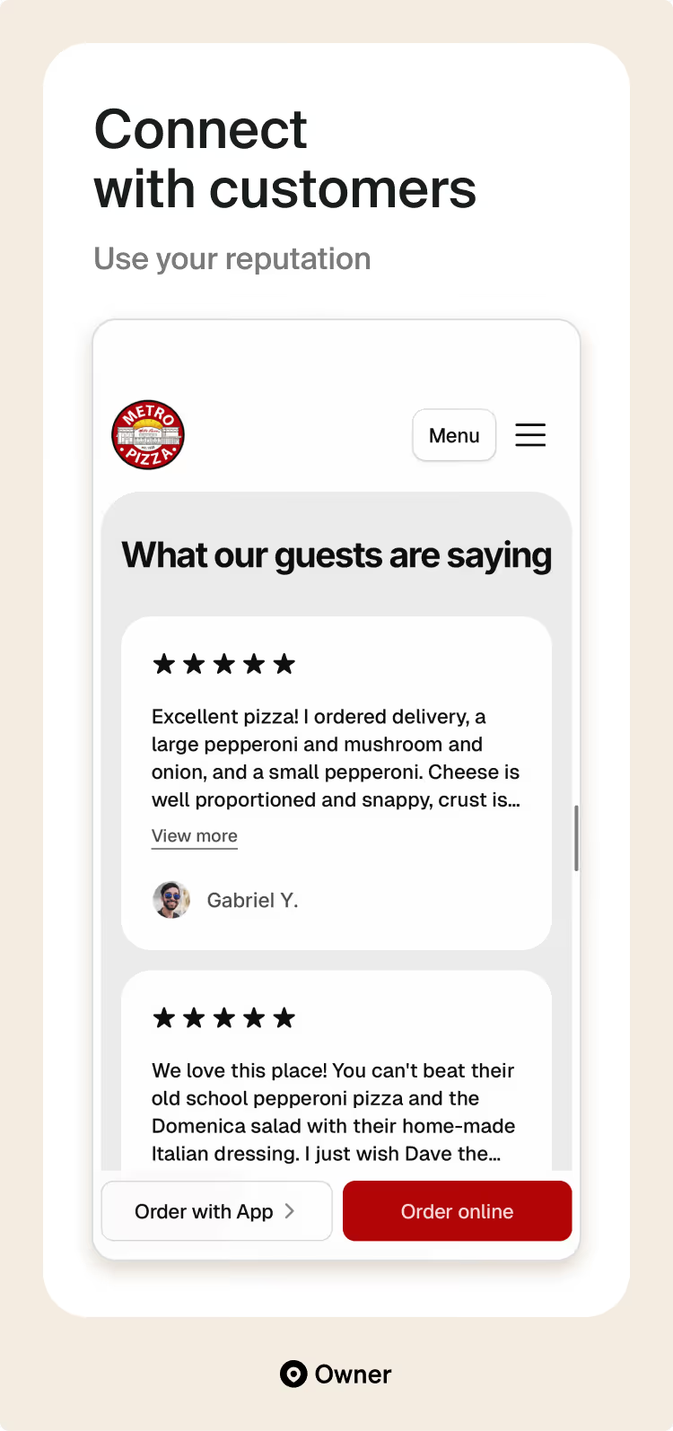
10. Metro Pizza
Metro Pizza builds a strong connection with customers by focusing on history, community and authentic recipes. Their website incorporates personal touches, such as customer reviews and family photos, to create a warm and inviting atmosphere.
From the first heading on the homepage to their story page with family photos, MetroPizza feels like a warm, welcoming place. The text, photos and reviews tell you how the staff will greet you with a smile and a hot, classically delicious pizza pie.
Why we love it:
- Legacy with a modern twist: They honor their history since 1928 through storytelling and "Old School" visuals, but the user experience is fully optimized for 2024, featuring a sticky mobile ordering button and clear CTA links.
- Engagement beyond the menu: The inclusion of pizza-making classes and trivia schedules transforms the site into a community destination, encouraging repeat visits to the page for more than just a Friday night pie.
11. Saffy's
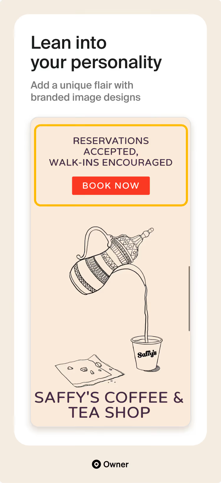
Saffy’s website has an inviting atmosphere and emphasizes community to foster strong customer connections. By focusing on the dining experience and highlighting the restaurant's personality, Saffy successfully differentiates itself from its competitors.
Their images are purposeful, with the top photo showing multiple dishes, hands reaching across the table and a freshly poured glass of wine. It shows action and community, and even its animated illustrations add a flair of personality, setting it apart from other restaurant images.
Why we love it:
- Personality-driven copy: The tagline "eat with your hands and drink with your friends" immediately sets a social, approachable tone that makes the restaurant feel like a community hub rather than just another upscale eatery.
- Segmented user experience: By giving the "Coffee & Tea Shop" its own visual space and "Learn More" call-to-action, the site effectively manages two different customer bases (the dinner crowd and the morning crowd) without confusing either.
- Radical transparency: Including the 4% employee-wellness charge directly on the homepage shows a level of honesty and social responsibility that builds immediate respect with the modern, conscious diner.
12. SushiMe Roll'n
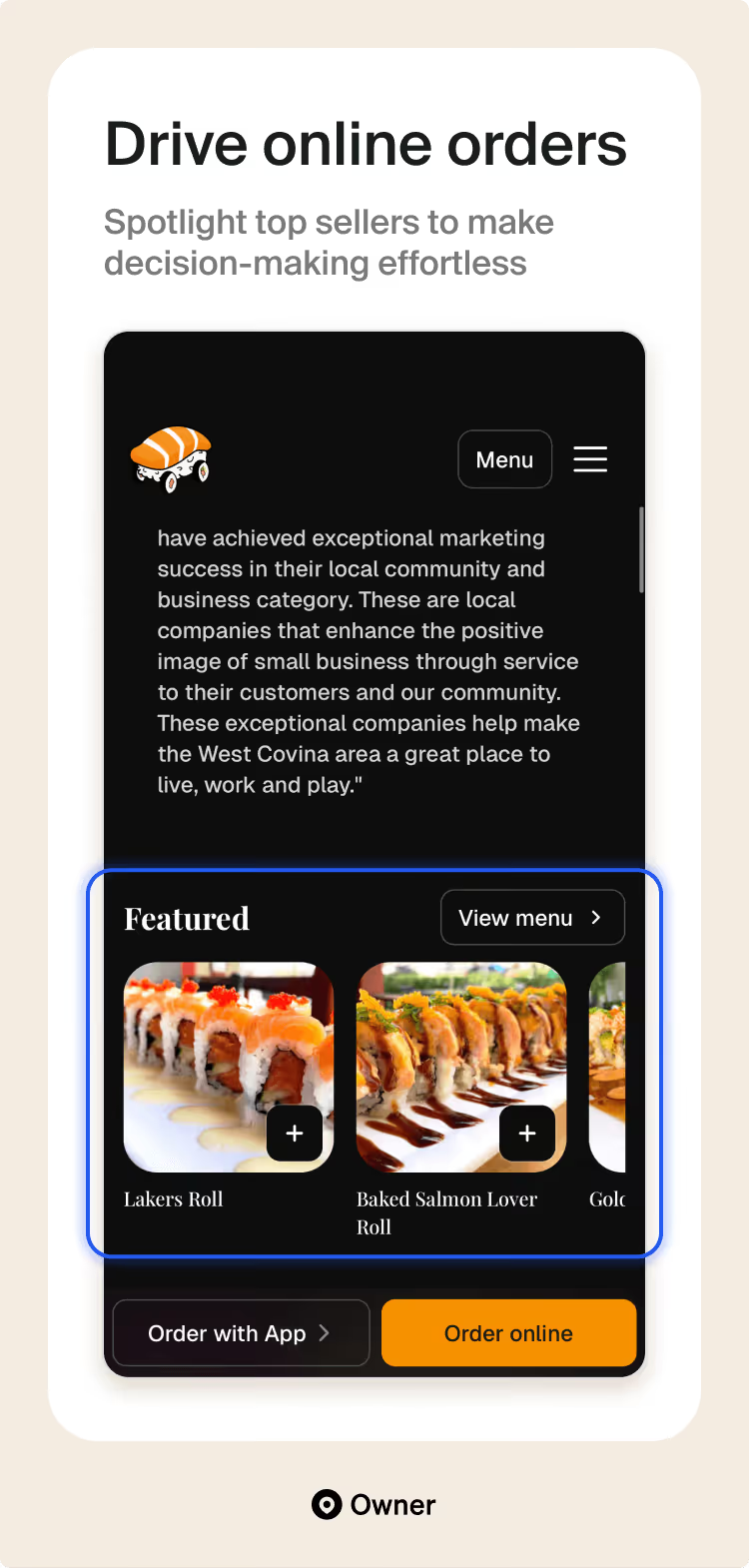
SushiMe Roll'n prioritizes conversions with a clear, focused restaurant site design. Their homepage features prominent CTAs, enticing promotions, and a user-friendly online ordering system, resulting in a significant increase in direct online sales.
By featuring high-quality images of their best-selling items, they create excitement and make ordering decisions easier for new customers. This strategy enhances engagement, builds trust in their menu and ultimately drives more sales.
Why we love it:
- Playful, high-energy branding: From the name itself to roll titles like "You See Me Roll'n," the site uses a consistent, fun voice that makes the brand feel approachable and memorable.
- Conversion-focused messaging: They do an excellent job of explaining the "Direct Order" benefit, explicitly telling customers that ordering via the site saves on fees and supports the local business.
- Social proof & authority: By prominently displaying their "Voted Best Sushi 2023" award and customer reviews, they build immediate trust with new visitors who might be looking for a reliable spot in West Covina.
13. Talat Market
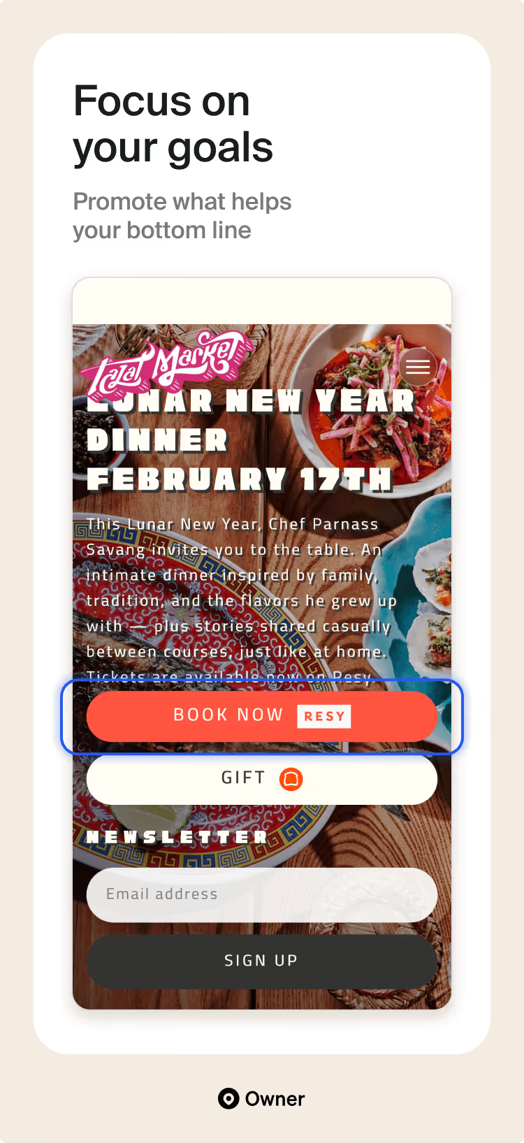
Talat Market prioritizes reservations and in-person dining experiences by prominently showcasing its location and hours on the homepage. Their website focuses on creating anticipation and excitement for the dining experience, encouraging customers to plan their visits in advance.
Where most restaurants place an “Order Online” button in the top-right corner, Talat Market promotes “Reservations” as their primary goal to encourage customers to commit to a date and come in to place their order.
Why we love it:
- Frictionless reservation flow: They lead with a prominent link to Resy, making it incredibly easy to go from "thinking about Thai food" to "booked for 7:00 PM" in just a few taps.
- Consistent aesthetic: The site’s clean lines and no-frills layout perfectly mirror the restaurant’s physical vibe—industrial, vintage and focused entirely on the quality of the ingredients rather than flashy distractions.
5 key restaurant website design tips
Whether you’re using a restaurant website builder or doing it yourself, you need a website that looks good while also driving sales and customer loyalty. To achieve this, every restaurant website needs these five key design components to be effective.
1. Improve navigation with a simple and mobile-friendly design
When customers land on your homepage, they should instantly know how to navigate your site. Keep the website design for your restaurant simple and resist the urge to add unnecessary content or images. Every element should serve a purpose and prioritize essential information, like contact information or the menu.
A simple, mobile-friendly design is also important for boosting sales across devices. Our recent Owner.com mobile marketing study backs this up, finding that restaurants with mobile apps see 85% more repeat customers.
Talkin’ Tacos, a popular food truck turned restaurant, is a great example of this. After struggling with a dated website, they nailed a sleek and user-friendly re-design for desktop and mobile. The small business also launched a fully branded app that earned 10,000 downloads in the first 90 days.
2. Showcase a beautiful online menu to boost sales
Your menu is a key sales tool—most visitors come to your site just to see it. Here’s how to design a strong restaurant menu that captures customers’ attention and keeps them from moving on:
- Drool-worthy photos: Ditch the blurry photos and PDFs. Use crisp, high-quality images that showcase the vibrancy and texture of your dishes.
- Persuasive food descriptions: Go beyond just listing ingredients. Craft concise descriptions that tell a story about the dish, mentioning sourcing or unique preparation methods.
- An easy-to-navigate layout: People scan online menus. Design a layout with clear spacing, well-organized categories and highlighted "Top Picks" to guide customer choices effortlessly.
- Popular item call-outs: Showcasing “Top Picks” at the top of the menu is a form of social proof that influences customers to buy what others already consider crowd favorites.
3. Create a seamless, high-converting checkout experience
Many owners assume they’ve won the sale once items are in the cart, but a clunky checkout process is the fastest way to lose a hungry customer. To prevent abandoned orders and keep the kitchen busy, your final steps must be effortless:
- Clear calls to action: Make checkout buttons prominent and easy to find. Include a cart indicator for quick order review.
- Upsell opportunities: Offer curated suggestions during checkout to tempt customers with additional items.
- Minimize required fields: Streamline the checkout form by requesting only essential information for order fulfillment.
- Security assurances: Display logos of trusted payment processors to build trust and encourage secure transactions.
- Saved payment options: Allow customers to save payment details for faster future purchases.
Still not sure how to achieve this goal? I’ve put together a more detailed guide on how to create online ordering for your restaurant.
4. Use social proof to build trust and credibility
Reviews are one of the fastest ways to build trust. That’s social proof—people trust other diners more than they trust your marketing.
But Nation’s Restaurant News reports that 63% of restaurants collect and store reviews—meaning 37% aren’t fully using this data to drive conversions.
By now, you’ve already earned reviews on platforms like Google Business Profile. The next step is to bring those ratings and testimonials onto your website so guests can instantly see your food and service delivery.
Make your reviews work harder:
- Showcase them prominently: Add star ratings or short testimonials to your homepage, menu and online ordering pages.
- Ask at the right time: Prompt customers for feedback right after their visit or order.
- Manage them smartly: Send positive reviews to public platforms and route negative ones for quick resolution.
You’ve earned the credibility, now put it where it converts.
5. Drive sales with mouthwatering food photography
Our restaurant website design survey found that 61% of guests say photos of your menu items are among the most important features your website can offer. In fact, restaurant guests almost always (43%) or usually (41%) look at photos of menu items before deciding to order. Making high-quality visuals crucial for capturing attention and enticing customers to try your food.
Here's why you should invest in mouthwatering menu photos:
- Enhanced user experience: High-quality photos elevate your website's professionalism and create a more engaging browsing experience for customers.
- Increased desire & sales: Compelling photos can make customers crave the dishes they see. This can significantly boost sales, especially for new or unfamiliar items.
- Visual storytelling: Pictures can showcase the quality, freshness and portion sizes of your food in a way that text descriptions simply can't.
By incorporating professional menu photography, like in the examples above, you can significantly increase the effectiveness of your online menu and convert more website visitors into paying customers.
Drive more orders with easy and effective marketing
A strong website gets attention. Smart marketing turns that attention into orders. Great design builds trust and makes ordering easy. Strategic marketing brings customers back and introduces you to new ones. When those two work together, revenue follows.
Restaurants using Owner.com’s system have seen online sales grow an average of 270% in 90 days by pairing high-converting websites with built-in marketing that keeps guests engaged.
If you need restaurant website inspiration or are ready to turn your website into a consistent sales engine, book a free demo to see how we can help you drive more orders and build lasting customer relationships.

.jpg)
.jpg)
